Sample Images
:max_bytes(150000):strip_icc():format(webp)/moist-banana-bread-recipe-995192-step-01-f3c2b3aee0ee456fa5cdc84904a7ec15.jpg)

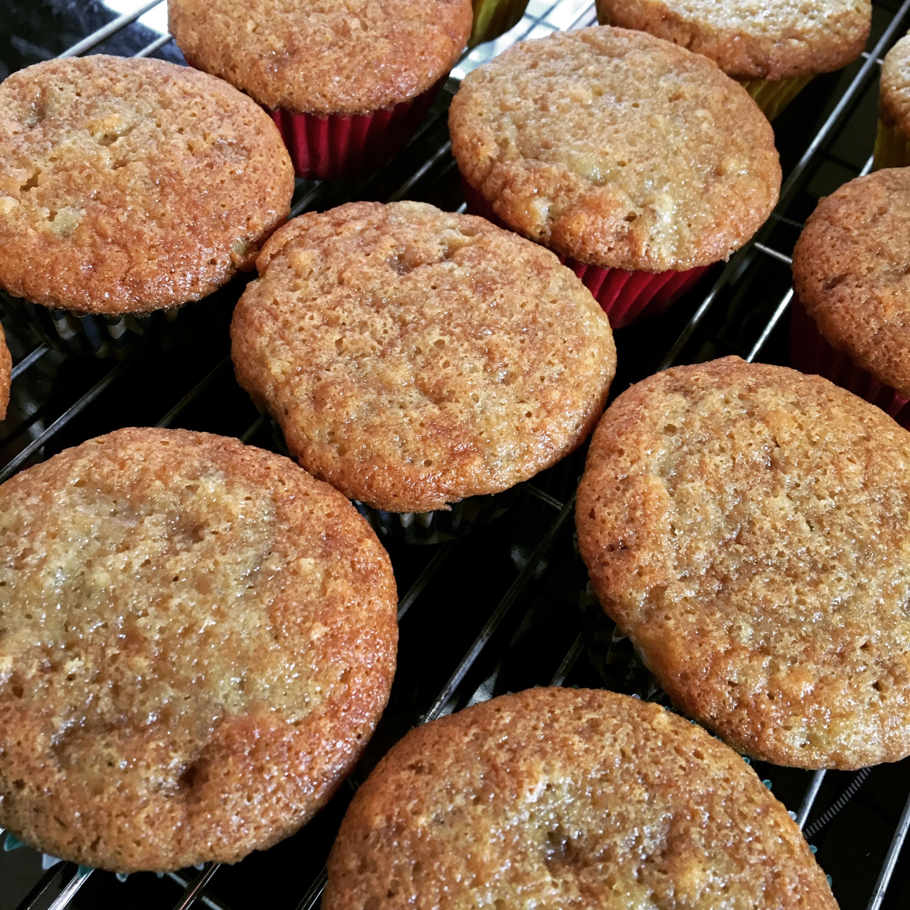
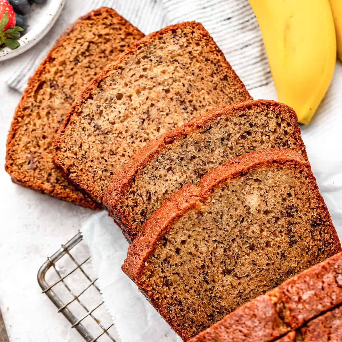
Banana bread is a beloved classic that has stood the test of time, delighting bakers and dessert enthusiasts alike. This simple yet versatile quick bread is a fantastic way to put overripe bananas to good use, transforming them into a delicious and moist treat. With its warm, homey flavor and tender crumb, banana bread is the perfect companion to your morning coffee or afternoon tea.


:max_bytes(150000):strip_icc():format(webp)/moist-banana-bread-recipe-995192-step-01-f3c2b3aee0ee456fa5cdc84904a7ec15.jpg)


This website has very clear and clean description on ingredients and instructions which is something I want my website be like(minimalistic and gentle).
website 2I really like the way it shows the instructions. It eliminates lots of distraction and really helps people to focus on what they need to do right now. The centered and card style is also intreresting to interact.
website 3This website has a very comfortable line length. The shorter line length makes me want to follow and feel less overwhelming and frustrating. Also the description is short and straightforward which create less confusion.
The color palletes and full-rounded corner are two elements that I want to follow with in terms of designing my own recipe website. The orange feels very delicous and tasting. The rounded corner of every button and bar is a personal preference and it makse the overal website feels soft and interesting to interact with.
855-how-to-quit ReferenceThis webiste has a very specific and stylistic design. The contrast of font size and value is something I want to achieve in my website. The smallest font size feels very delicate. I also like the tags on the right row which add on more persona to the website. It also has something interesting user respond happening such as zoom in and color shift when there's a hover. I especially love how it embeds the topic (medicine and pills) into the title.
ChloeYan ReferenceI love the plyafulness of the design. It's very literal and there's lots of interaction happening around. In her project called Stroll, everything is very centered. The wide margin on left and right feels very comfortable.